今回はHTMLとTailwindを使ってお問い合わせフォームを作ってみます。
完成品はこちら。
Tailwindのインストールと設定
Tailwind公式サイトのTailwind CLIの記述を参考にインストールをしていきます。
npm(Node.js)を使用します。
最初に、
npm init -yで、package.jsonファイルを作っておきましょう。
Tailwindをインストールする
その後ターミナルで、
npm install -D tailwindcssを実行してTailwindをインストール。
ちなみに -D オプションは –save-devと同一で、開発環境のみでのインストールです。
次に、
npx tailwindcss initを実行して、tailwind.config.jsを作成します。
テンプレートのパスを追加する
tailwind.config.jsにテンプレートファイルへのパスを追加します。
/** @type {import('tailwindcss').Config} */
module.exports = {
  content: ["./src/**/*.{html, js}"],
  theme: {
    extend: {},
  },
  plugins: [],
};
“./src/**/*.{html, js}”は、srcフォルダの中の、拡張子が.htmlか.jsのファイルを指します。
CSSファイルにTailwindの指示を書く
srcフォルダを作成してその下に、input.cssを作成して、その中に
@tailwind base;
@tailwind components;
@tailwind utilities;
と書きます。
それぞれ、Tailwindのベースのスタイル、コンポーネントクラス、ユーティリティクラスが、ビルドされるCSSに挿入されます。
Tailwind CLIでビルドプロセスを開始する
まずはテンプレートファイルになる、contact.htmlをsrcディレクトリの中に作成しておきます。
<!DOCTYPE html>
<html lang="ja">
<head>
  <meta charset="UTF-8">
  <meta http-equiv="X-UA-Compatible" content="IE=edge">
  <meta name="viewport" content="width=device-width, initial-scale=1.0">
  <title>お問い合わせフォーム</title>
</head>
<body>

</body>
</html>
CLIツールを走らせて、テンプレートファイルをスキャンして、CSSをビルドします。
ターミナルで、
npx tailwindcss -i ./src/input.css -o ./src/output.css --watchを実行すると、HTMLファイル内の変更に合わせて、自動的にoutput.cssが修正されます。
ちなみに、オプションで–minifyをつけて、
npx tailwindcss -i ./src/input.css -o ./src/output.css --watch --minifyとすると、圧縮板のCSSが生成されます。
ここでは、srcディレクトリの中にファイルをまとめていきます。
HTMLの中でTailwindを使う
コンパイルされたCSSを<head>タグの中に加えて、Tailwindのクラスを使用します。
src/contact.html
<!DOCTYPE html>
<html lang="ja">
<head>
<meta charset="UTF-8" />
<meta http-equiv="X-UA-Compatible" content="IE=edge" />
<meta name="viewport" content="width=device-width, initial-scale=1.0" />
<title>お問い合わせフォーム</title>
<link rel="stylesheet" href="output.css" />
</head>
<body>
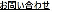
<h1 class="text-3xl font-bold underline">お問い合わせ</h1>
</body>
</html>
head内にlinkタグを追加して、コンパイルされたoutput.cssを読み込みます。
bodyタグの中にh1で見出しを作ります。
今回は、お問い合わせフォームを作る予定なので、「お問い合わせ」としておきました。
ブラウザで見ると、こんな感じです。
きちんと反映されていますね。
お問い合わせフォームの作成
ではお問い合わせフォームの作成に移りましょう。
HTMLで骨組みを作成
いったんHTMLだけ作っておきました。
contact.html
<!DOCTYPE html>
<html lang="ja">
<head>
<meta charset="UTF-8" />
<meta http-equiv="X-UA-Compatible" content="IE=edge" />
<meta name="viewport" content="width=device-width, initial-scale=1.0" />
<title>お問い合わせフォーム</title>
<link rel="stylesheet" href="output.css" />
</head>
<body>
<section>
<h1>お問い合わせ</h1>
<p>
お問い合わせは下記のフォームからお願いいたします。<br /><span> * </span
>は必ず入力してください。
</p>
<form>
<div>
<label for="type">お問い合わせの種類 <span> * </span></label
><select id="type">
<option>商品について</option>
<option>会社について</option>
<option>その他</option>
</select>
</div>
<div>
<label for="name">名前 <span> * </span></label
><input id="name" type="text" placeholder="山田太郎" />
</div>
<div>
<label for="furigana">フリガナ</label
><input type="text" id="furigana" placeholder="ヤマダタロウ" />
</div>
<div>
<label for="email">メールアドレス <span> * </span></label
><input type="email" id="email" placeholder="yamada@example.com" />
</div>
<div>
<label for="tel">電話番号</label
><input type="text" id="tel" placeholder="00000000000" />
</div>
<div>
<label for="zipcode">郵便番号</label
><input type="text" id="zipcode" placeholder="0000000" />
</div>
<div>
<label for="address">住所</label><input type="text" id="address" />
</div>
<div>
<label for="body">お問い合わせ内容 <span> * </span></label
><textarea name="body" id="body" cols="30" rows="10"></textarea>
</div>
<div>
<button>確認</button>
</div>
</form>
<p>©2022 Takuyay. All rights reserved.</p>
</section>
</body>
</html>
ブラウザで見るとこんな感じです。味気ないですね。
これにTailwind CSSを書き加えていきましょう。
Tailwind CSS を書き加える
公式ドキュメントを参考に、まずbodyの色を薄灰色にします。
class=””の中に、Tailwind指定のクラス名を書いていきます。
<body class="bg-gray-50">次にラッパー的なsectionをflexにして、中の要素をcolumnで縦に並べるようにします。
文字色や幅、パディングなども調整します。
<section class="text-gray-600 w-full flex flex-col items-center px-2">フォーム上部にあるh1タグやpタグは、テキストの色、太さやマージンなどの調整を行います。
      <h1 class="text-3xl font-bold mt-10">お問い合わせ</h1>
      <p class="m-10">
        お問い合わせは下記のフォームからお願いいたします。<br /><span
          class="text-red-600"
        >
          * </span
        >は必ず入力してください。
      </p>
form部分のCSS
まずformの枠を作ります。角丸のカードっぽくします。ドロップシャドウつき。
<form class="shadow-md rounded-md bg-white w-full max-w-2xl p-10">w-fullは、width: 100%;で、max-w-2xlはmax-width: 42rem; /* 672px */ です。
selectの部分
「お問い合わせの種類」のselectタグの部分です。
Tailwindはモバイルファーストです。
どういうことかというと、下記のコードでsm:というプレフィックスがついたクラスは、sm(640px)以上の幅にならないと効かないということです。
つまり @media (min-width: 640px) { … } と同じということです。
普段、逆のmax-widthでやってる場合はちょっと混乱しますね。
        <div class="flex sm:items-center mb-6 flex-col sm:flex-row">
          <label
            class="block sm:w-1/3 font-bold sm:text-right mb-1 pr-4"
            for="type"
            >お問い合わせの種類 <span class="text-red-600"> * </span></label
          ><select
            class="block w-full sm:w-2/3 bg-gray-200 py-2 px-3 text-gray-700 border border-gray-200 rounded focus:outline-none focus:bg-white"
            id="type"
          >
            <option>商品について</option>
            <option>会社について</option>
            <option>その他</option>
          </select>
        </div>
デフォルトでは、flex-colでlabelとselect部分が縦になるようにしています。
画面幅が640px以上になると、sm:flex-rowが働き、横並びになります。
横並びの場合、labelは幅全体の1/3、selectは幅全体の2/3の広さになります。
あとは、selectの枠の色を変えたりなどしています。
その他のinputの部分
その他のinputの部分も、selectの部分とだいたい同じです。
色形を統一して、同じように640px以上で並びが変わります。
        <div class="flex sm:items-center mb-6 flex-col sm:flex-row">
          <label
            class="block sm:w-1/3 font-bold sm:text-right mb-1 pr-4"
            for="name"
            >名前 <span class="text-red-600"> * </span></label
          ><input
            class="block w-full sm:w-2/3 bg-gray-200 py-2 px-3 text-gray-700 border border-gray-200 rounded focus:outline-none focus:bg-white"
            id="name"
            type="text"
            placeholder="山田太郎"
          />
        </div>
        <div class="flex sm:items-center mb-6 flex-col sm:flex-row">
          <label
            class="block sm:w-1/3 font-bold sm:text-right mb-1 pr-4"
            for="furigana"
            >フリガナ</label
          ><input
            class="block w-full sm:w-2/3 bg-gray-200 py-2 px-3 text-gray-700 border border-gray-200 rounded focus:outline-none focus:bg-white"
            type="text"
            id="furigana"
            placeholder="ヤマダタロウ"
          />
        </div>
        <div class="flex sm:items-center mb-6 flex-col sm:flex-row">
          <label
            class="block sm:w-1/3 font-bold sm:text-right mb-1 pr-4"
            for="email"
            >メールアドレス <span class="text-red-600"> * </span></label
          ><input
            class="block w-full sm:w-2/3 bg-gray-200 py-2 px-3 text-gray-700 border border-gray-200 rounded focus:outline-none focus:bg-white"
            type="email"
            id="email"
            placeholder="yamada@example.com"
          />
        </div>
        <div class="flex sm:items-center mb-6 flex-col sm:flex-row">
          <label
            class="block sm:w-1/3 font-bold sm:text-right mb-1 pr-4"
            for="tel"
            >電話番号</label
          ><input
            class="block w-36 bg-gray-200 py-2 px-3 text-gray-700 border border-gray-200 rounded focus:outline-none focus:bg-white"
            type="text"
            id="tel"
            placeholder="00000000000"
          />
        </div>
        <div class="flex sm:items-center mb-6 flex-col sm:flex-row">
          <label
            class="block sm:w-1/3 font-bold sm:text-right mb-1 pr-4"
            for="zipcode"
            >郵便番号</label
          ><input
            class="block w-24 bg-gray-200 py-2 px-3 text-gray-700 border border-gray-200 rounded focus:outline-none focus:bg-white"
            type="text"
            id="zipcode"
            placeholder="0000000"
          />
        </div>
        <div class="flex sm:items-center mb-6 flex-col sm:flex-row">
          <label
            class="block w-full sm:w-1/3 font-bold sm:text-right mb-1 pr-4"
            for="address"
            >住所</label
          ><input
            class="block w-full sm:w-2/3 bg-gray-200 py-2 px-3 text-gray-700 border border-gray-200 rounded focus:outline-none focus:bg-white"
            type="text"
            id="address"
          />
        </div>
        <div class="flex sm:items-center mb-6 flex-col sm:flex-row">
          <label
            class="block sm:w-1/3 font-bold sm:text-right mb-1 pr-4"
            for="body"
            >お問い合わせ内容 <span class="text-red-600"> * </span></label
          ><textarea
            class="block w-full sm:w-2/3 bg-gray-200 py-2 px-3 text-gray-700 border border-gray-200 rounded focus:outline-none focus:bg-white"
            name="body"
            id="body"
            cols="30"
            rows="10"
          ></textarea>
        </div>
button部分
ボタン部分は、そんなに複雑ではないです。
buttonタグが真ん中に来るように配置して色や広さを調整するだけです。
        <div class="flex justify-center">
          <button
            class="bg-blue-500 hover:bg-blue-700 text-white font-bold py-2 px-4 rounded fucus:outline-none focus:shadow-outline mt-3"
          >
            確認
          </button>
        </div>
css的に言うと、display: flex; の justify-content: center; で真ん中に寄せています。
ボタンは角丸にして色を付けて、フォーカスしたときに色が変わったりです。
コピーライト部分
コピーライト部分はおまけです。
文字サイズを小さくして、灰色にしてマージンを入れました。
<p class="my-5 text-gray-500 text-sm">
©2022 Takuyay. All rights reserved.
</p>
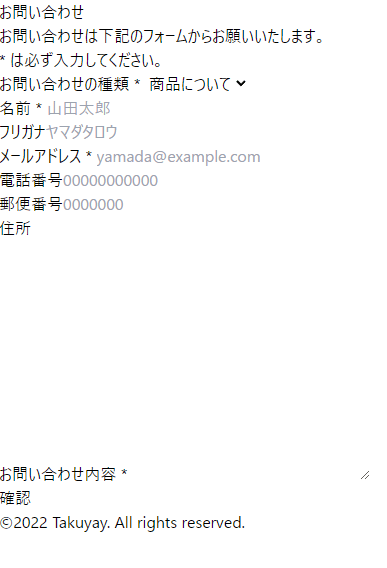
ブラウザで見てみる
ではブラウザで見てみましょう。

きちんと表示されていますね。
念のため、Githubにコードを上げておきます。
以上です。
コメント